On Pinterest, design is strategy. A technically perfect pin with beautiful photography and optimal keywords can fail if the visual design doesn’t stop the scroll. Conversely, average photography elevated by excellent composition, typography, and color use can outperform polished content in almost every metric. This guide gives you a complete framework for Pinterest pin design in 2026 — from foundational principles to practical tools and templates.
Why Pinterest Pin Design Matters More Than You Think
Pinterest is a visual search engine. Users process images before they read text — meaning your visual design choices trigger the initial decision to engage or scroll past. The average Pinterest user makes this decision in under half a second. Design optimized for that half-second attention capture is the foundation of every successful pin.
The Competitive Reality of Pinterest Feeds
Your pin doesn’t appear in isolation — it competes visually with dozens of other pins visible on screen simultaneously. The pins that capture attention in this competitive context share specific visual characteristics: strong contrast, intentional composition, clear dominant element, and appropriate emotional tone for the niche. Understanding these characteristics lets you engineer attention-capture into your design process.
Design Signals That Affect Algorithm Distribution
Pinterest’s algorithm evaluates pins partly based on engagement signals — close-up rate, save rate, click-through rate — that are directly influenced by design quality. A well-designed pin earns stronger engagement signals, which triggers broader algorithmic distribution, which generates more impressions and further engagement. Design quality is therefore both a direct and indirect driver of Pinterest reach.
Pinterest Pin Dimensions and Specifications in 2026
Getting dimensions right is the non-negotiable foundation of Pinterest pin design.
Standard Pin Dimensions
Pinterest recommends a 2:3 aspect ratio for standard pins, with 1000×1500 pixels being the ideal size. This ratio fills the most vertical space in Pinterest’s masonry grid layout, which directly correlates with higher impression share — taller pins are literally more visible on screen. Square (1:1) and horizontal pins display smaller and generate fewer impressions on average.
Idea Pin Dimensions
Idea Pins use a 9:16 aspect ratio (1080×1920 pixels) — full vertical format, similar to Instagram Stories or TikTok. For video Idea Pins, this format maximizes screen coverage on mobile, where the vast majority of Pinterest users scroll.
File Format and Size
Use PNG for graphics with text (sharper rendering) and JPG for photographs (smaller file size). Keep files under 20MB — Pinterest compresses larger files, which can degrade quality. For video pins, MP4 or MOV up to 2GB, 1080p resolution minimum.
Design Principles for High-Performing Pins
These principles apply across niches and content types. Mastering them is more valuable than any specific template or tool.
Contrast Is King
Contrast — between light and dark, between saturated and muted colors, between text and background — is the primary visual mechanism that makes elements stand out. High-contrast pins are visible at small sizes, work in both light and dark mode interfaces, and attract attention in crowded feeds. If your current pins feel “flat” or invisible, insufficient contrast is usually the diagnosis.
Establish a Clear Visual Hierarchy
Every pin should have one dominant element — the main photograph, the headline text, or the central graphic — that the eye is drawn to first. Secondary elements support this dominant focal point. Pins with too many equally weighted elements create visual noise that the brain dismisses quickly. Ask: “What is this pin about?” and make the answer visually obvious in one glance.
Typography That Performs on Small Screens
Pinterest pins are browsed on mobile screens where text renders small. Use fonts with clear x-heights and good letter spacing. Bold, sans-serif fonts are the most legible at small sizes. Avoid intricate script fonts for key information — they look beautiful on a 27-inch monitor and illegible on a phone screen. Test your pin design at 150px wide to simulate mobile thumbnail appearance.
Strategic Use of White Space
White space (negative space) around your central elements makes them feel premium and increases visual attention on the elements themselves. Cluttered designs feel cheap; designs with intentional white space feel considered and trustworthy. This applies whether your background is white, dark, or a saturated color — the principle is space around the focal element, not literal white.
Pin Design Elements That Drive Click-Through
Beyond foundational principles, these specific elements consistently improve pin click-through rates when tested.
Lifestyle Photography vs. Product Photos
Pinterest users respond to lifestyle imagery — products shown in context, in use, in beautiful settings. Pure product-on-white-background performs worse on Pinterest than the same product photographed in a styled environment. If you’re limited to product photography, use design elements (backgrounds, overlays, complementary props) to create context and aspiration.
Faces in Pins
Pins with human faces receive significantly higher engagement in lifestyle and fashion niches. Humans are hard-wired to look at other human faces — it’s an attention-capture mechanism that works across cultures. In niches where faces are relevant (beauty, fitness, fashion, food), featuring clear, well-lit faces in your pin imagery is a direct engagement lever.
Text Overlays That Add Information Value
Text overlays perform best when they add information the image alone doesn’t communicate: a recipe title that makes viewers hungry, a product benefit that creates desire, a question that creates curiosity. Text that merely restates what the image shows (“Beautiful living room”) provides no additional value and reduces click motivation.
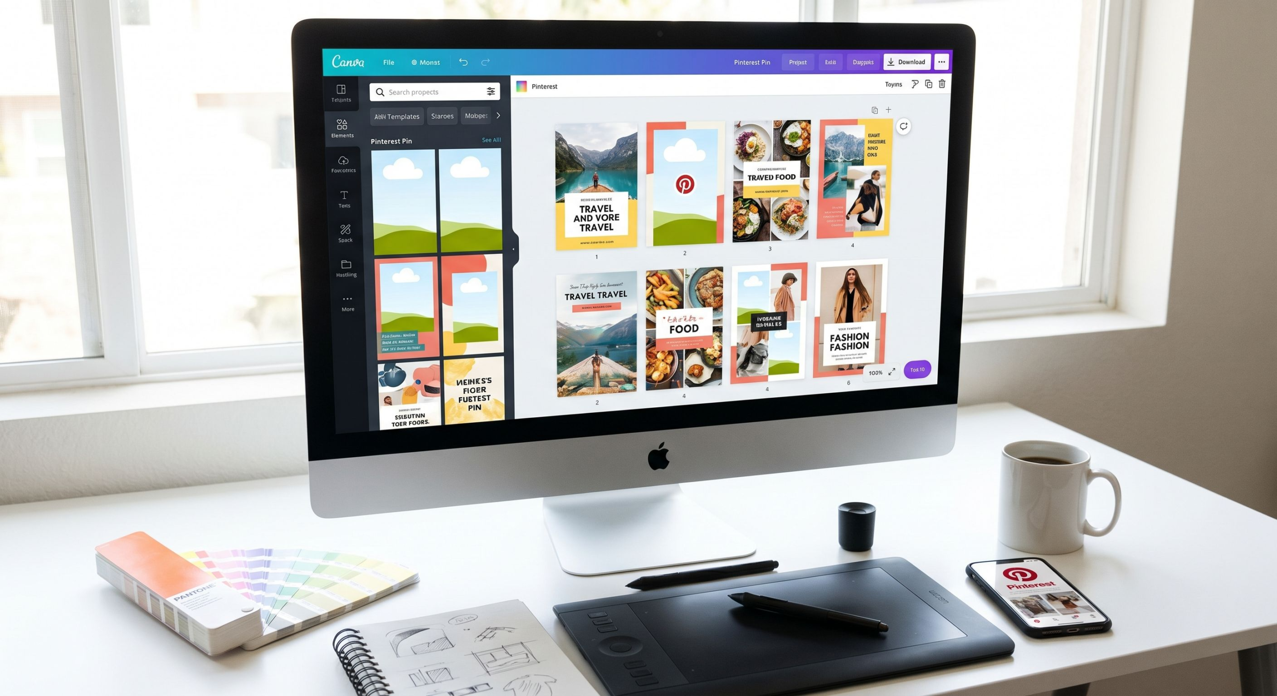
Pinterest Pin Design: Tool Comparison
| Tool | Best For | Pinterest Templates | Learning Curve | Price |
|---|---|---|---|---|
| Canva | Beginners to intermediate | Extensive (1000+ pin templates) | Low | Free / Pro $12.99/mo |
| Adobe Express | Adobe users | Good selection | Low-Medium | Free / Premium $9.99/mo |
| Photoshop/Lightroom | Photography-heavy pins | Manual (custom) | High | From $20.99/mo |
| PicMonkey | Photo-focused creators | Good selection | Low | From $7.99/mo |
| Tailwind Create | Pinterest-specific workflows | Pinterest-optimized | Low | Included with Tailwind subscription |
Creating a Consistent Pin Design System
The most efficient Pinterest creators don’t design each pin from scratch — they build a design system that enables rapid, consistent production at scale.
Defining Your Brand Colors
Choose 2-3 primary brand colors that appear consistently across your pins. These colors should be distinctive within your niche, visually cohesive with each other, and appropriate for your content’s emotional tone (warm and cozy for home decor, bright and energetic for fitness, clean and minimal for tech). Store color hex codes somewhere accessible for consistent application.
Creating Pin Templates
In Canva or your design tool of choice, create 3-5 base templates for your most common pin types: blog post pin, product pin, tips/list pin, quote pin, video pin cover. Templates include your brand fonts, colors, logo placement, and overall layout structure. Each new pin requires only swapping the photography and updating the text — reducing creation time from 30 minutes to 5 minutes per pin once templates are established.
Building a Consistent Visual Style
Beyond colors and fonts, consistency in photography style (lighting, setting, mood), graphic elements (shapes, borders, icon styles), and composition approach creates brand recognition across your pin library. When users repeatedly encounter your distinctive style across different pins, your content becomes recognizable at a glance — increasing save rate and follower conversion.
FAQ: Pinterest Pin Design
What is the best size for a Pinterest pin?
1000×1500 pixels (2:3 ratio) is the optimal size for standard pins. This fills maximum vertical space in Pinterest’s grid layout, directly correlating with higher impression share. Going larger (2000×3000) can provide sharper quality but rarely improves performance proportionally to the file size increase.
Should I add my logo to every Pinterest pin?
Add a small, subtle logo in a corner (lower right is most common). It protects your brand if pins are saved and reshared, builds cumulative brand recognition, and helps followers identify your content in crowded feeds. Don’t make the logo so large it dominates the design — subtle but visible is the goal.
How many text words should a Pinterest pin include?
Overlay text of 5-10 words is typical for most pin types. Long enough to communicate clear value (“5 kitchen storage ideas that will change your life”), short enough to be readable at a glance. Exception: infographic pins with multiple labeled sections can use more text effectively, as the purpose is the information itself.
What fonts work best for Pinterest pins?
Bold sans-serif fonts (Montserrat Bold, Poppins, Lato Black) for headlines and key information. Clean serif fonts (Playfair Display, Merriweather) for elegant niches like home decor and weddings. Avoid highly decorative fonts for functional text. Always prioritize legibility over style — especially for mobile viewers.
Do Pinterest pins need a call to action?
Yes, especially for pins meant to drive website traffic. “Get the recipe,” “Shop the look,” “Read the full guide,” or simply “Click to see more” gives viewers a clear next action. Pins without CTAs rely on viewers being self-motivated enough to click — CTAs make the desired action explicit and increase click-through rate measurably.
Conclusion
Pinterest pin design is a learnable craft that pays dividends indefinitely. Every pin you design well works for you around the clock — appearing in search results, circulating in feeds, and driving traffic to your content months or years after creation. Start by establishing your brand colors and fonts, create 3-5 templates you can reuse efficiently, and commit to the principles of contrast, visual hierarchy, and legibility in every design decision. Over time, your design consistency becomes a recognizable brand signal that compounds with your growing pin library into a powerful Pinterest presence.
Leave a Reply